Nothing®
A redesign for Nothing Phone (2) focused on creating an intuitive interface that highlighted the phone's unique features while maintaining ease of navigation.
Nothing®
Phone (2) Landing Page
Role
UX / UI Web Design
Year
2023
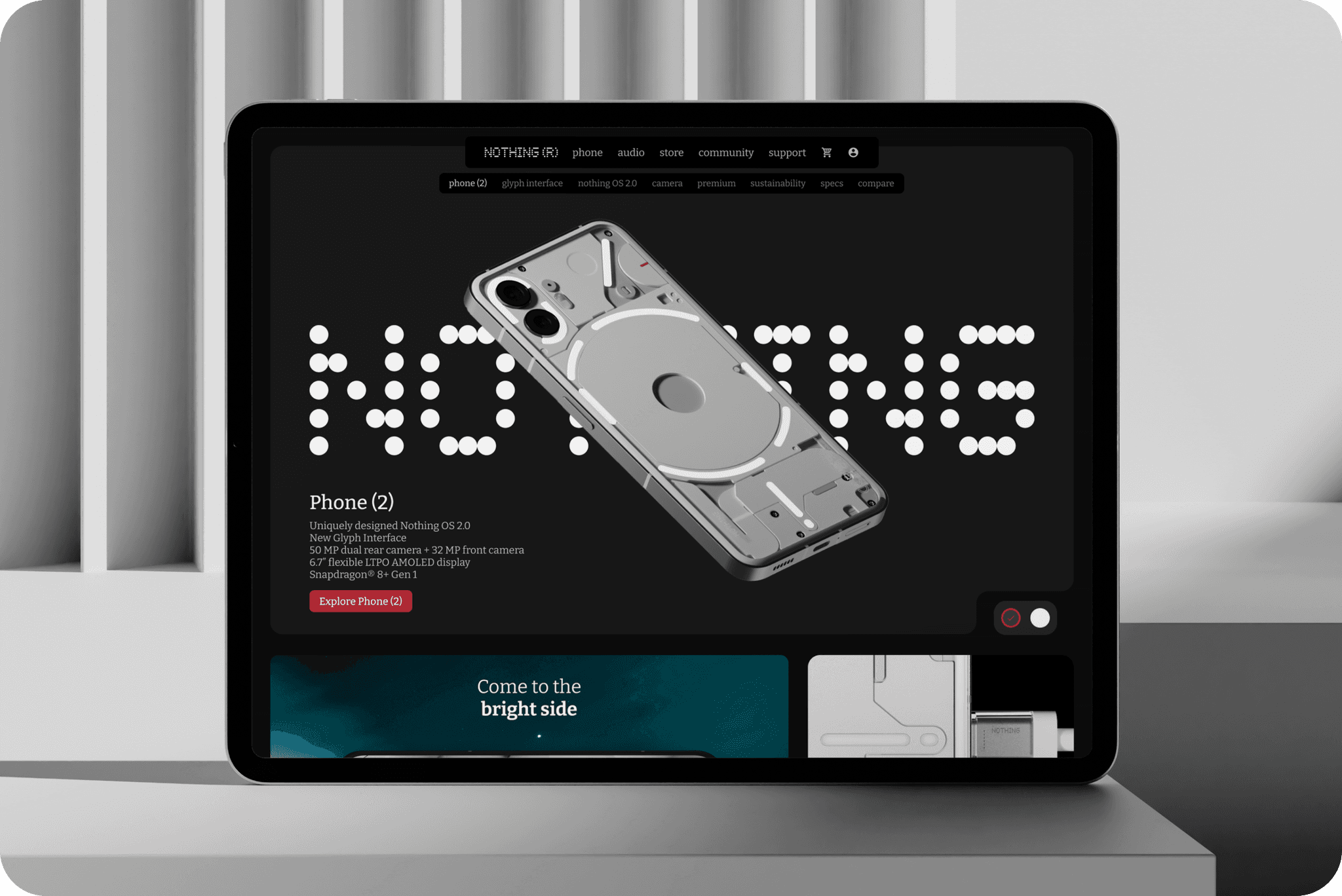
Intuitive Interface and Simplified User Journey
The redesign of the homepage was grounded in user-centric principles. I aimed to simplify the user journey, enabling a fluid transition from discovery to purchase.
The layout was structured to provide a logical flow of information, guiding the user through the phone's features, reviews, and related products, culminating in a streamlined checkout process.

Aesthetic Harmony and Product Showcase
The visual design of the homepage mirrors the minimalist aesthetic of the Nothing Phone 2. With a clean, monochromatic colour scheme and ample white space, I crafted an environment that allows high-quality product images to take centre stage.
The use of subtle animations and dynamic typography ensures that the user's attention is drawn to key information and calls to action.


Responsive Design System
Understanding the diversity of devices used to access the site, the redesign incorporates a responsive design system. This ensures that the visual impact and usability of the homepage remain consistent across all screen sizes and resolutions, from desktops to mobile devices.


Engaging Content Strategy
The content strategy was overhauled to better engage the user. This included the creation of compelling headlines, informative feature highlights, and persuasive product descriptions.
Each copy element was meticulously crafted to resonate with the target audience, positioning the Nothing Phone 2 as not just a smartphone, but a lifestyle companion.

Metrics for Success: User Engagement and Conversion
Post-launch, the effectiveness of the redesign will be evaluated based on key performance indicators such as user engagement metrics and conversion rates.
The implementation of A/B testing and user feedback loops will further refine the design, ensuring that the homepage evolves in line with user needs and preferences.